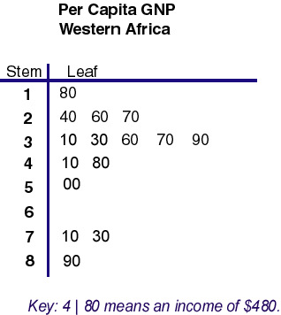
A stem and leaf plot is similar to a histogram, however it is able to display more information, giving more detail about individual values and arranges the data by place values. Largest digits are the stem, smaller are the leaves. As you can see, this stem and leaf plot shows the GNP per capita of Western Africa. $890 being the most, $180 being the least.
GIS3015 Map Catalog
Thursday, July 7, 2011
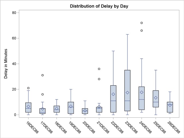
49. Box Plot
A box plot summarizes median, upper and lower quartiles, and minimum and maximum data values, drawn either vertically or horizontally. Simply, the line in the middle is the median and the box contains 50% of the data. This one is being used to show many different flights and delay of distribution by minutes.
48. Histogram
Histograms are bar graphs which show frequency distribution, where the variable classes have been divided are shown proportionally by the width of the bar, and the heights of the bars are proportional to class frequencies. Categories are listed horizontally and the number of occurances are listed vertically. This particular historgram was made taken information from the 2000 U.S. Census showing travel times for working Americans.
47. Parallel Coordinate Graph
Parallel coordinate graphs use parallel coordinates to present statistics and are used to plot large multivariate sets of data. In the data plot, each variable is has its own "y" axis on the graph. This parallel coordinate graph plotted fast car acceleration, working with many dimensions.
46. Triangular Plot
A triangular plot depicts ratios of three variables in positions on an equilateral triangle. The three variables have to sum the constant. This is a triangular plot area on which soil textures are defined as proportions of sand, silt and clay.
45. Windrose
A wind rose is a tool used by meteorologists and geographers to give a succinct look at how direction and wind speed are usually distributed at a specific area, they're site specific. Each of the usual 36 spokes used gives information on the wind and speed. This windrose is of wind data taken from Maine.
44. Climograph
A climograph is a graph of the monthly precipitation and temperature for a certain area. A bar graph shows the precipitation and a line graph shows the temperature. You can see an example of this with the climograph of Moscow, Russia, displayed here.
Subscribe to:
Posts (Atom)


