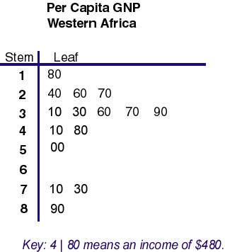
A stem and leaf plot is similar to a histogram, however it is able to display more information, giving more detail about individual values and arranges the data by place values. Largest digits are the stem, smaller are the leaves. As you can see, this stem and leaf plot shows the GNP per capita of Western Africa. $890 being the most, $180 being the least.
Thursday, July 7, 2011
49. Box Plot
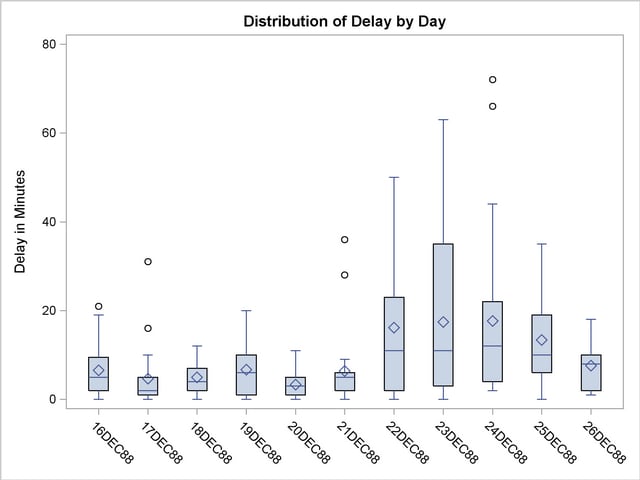
A box plot summarizes median, upper and lower quartiles, and minimum and maximum data values, drawn either vertically or horizontally. Simply, the line in the middle is the median and the box contains 50% of the data. This one is being used to show many different flights and delay of distribution by minutes.
48. Histogram
Histograms are bar graphs which show frequency distribution, where the variable classes have been divided are shown proportionally by the width of the bar, and the heights of the bars are proportional to class frequencies. Categories are listed horizontally and the number of occurances are listed vertically. This particular historgram was made taken information from the 2000 U.S. Census showing travel times for working Americans.
47. Parallel Coordinate Graph
Parallel coordinate graphs use parallel coordinates to present statistics and are used to plot large multivariate sets of data. In the data plot, each variable is has its own "y" axis on the graph. This parallel coordinate graph plotted fast car acceleration, working with many dimensions.
46. Triangular Plot
A triangular plot depicts ratios of three variables in positions on an equilateral triangle. The three variables have to sum the constant. This is a triangular plot area on which soil textures are defined as proportions of sand, silt and clay.
45. Windrose
A wind rose is a tool used by meteorologists and geographers to give a succinct look at how direction and wind speed are usually distributed at a specific area, they're site specific. Each of the usual 36 spokes used gives information on the wind and speed. This windrose is of wind data taken from Maine.
44. Climograph
A climograph is a graph of the monthly precipitation and temperature for a certain area. A bar graph shows the precipitation and a line graph shows the temperature. You can see an example of this with the climograph of Moscow, Russia, displayed here.
43. Population Profile
The definition of a population profile is a chart showing the number of people as a function of their ages. This one shows the population in illions of less developed countries in 2000.
42. Scatterplot
A scatterplot is a type of diagram which uses coordinates to display the values of a set of data from two variables, which are represented on the horizontal and verticles axis. The scatterplot presented here displays data from 113 countries showing the viewer how rich various countries are versus how much their wealth is shared, focusing on the U.S.
Tuesday, July 5, 2011
41. Index Value Plot
An index value plot depicts relativity of values from an indexed value onto a line graph. This is an S&P 500 stock index showing the value that it has kept throughout the year.
40. Accumulative Line Graph
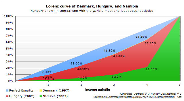
An accumulative line graph, or Lorenz curve, shows the proportionality of distribution, representing the probability of distribution and commonly used in analysis of inequality and economics. It usually presents income distribution, using percentages of incomes and households. This curve shows the income proportionality comparing three different countries of varying development: Denmark, Hungary, and Namibia.
39. Bilateral Graph
A bilateral graph depicts positive and negative values onto a single graph, often displayed as a bar graph, up and down from a zero line, but may also be displayed other ways. This bilateral graph shows annual revenues from various nations around the world in U.S. dollars (millions).
Friday, July 1, 2011
38. Nominal Area Choropleth Map
Nominal area choropleth maps present nominal details without necessarily having an order, usually with colors describing the quantitative data. This is a map which presents data of worldwide nominal GDP per capita.
37. Unstandardized Choropleth Map
Unstandardized choropleths maps reveal raw data and real numbers rather than percentages or some other form of standardization. This map has colors which represent the amount of orchard acres across the U.S.
36. Standardized Choropleth Map
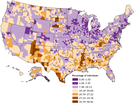
Standardized choropleth maps show rates/ratios, which are standardized to allow for comparing distribution, normalizing for a specific area. So, this choropleth map shows percentages of individuals living in poverty in U.S. counties, not raw data.
35. Univariate Choropleth Map
Univariate choropleth maps present one set of variable data. This map shows the median household income in the U.S. for each state, where darker shades represent higher incomes.
34. Bivariate Choropleth Map
A bivariate choropleth map displays two variables on a single map by combining two different sets of symbols or colors. The map displayed here combines the population of young people under the age of 18, reds, and the rural population, blues, giving a leged which shows what their combinations mean.
33. Unclassed Choropleth Map
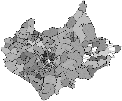
Unclassed choropleth maps represent values by proportional degrees of darkness, so that map doesn't have to classify the data. Such as with this map showing proportion of children 0-15 using a continuous grayscale, there's no definite set of figures given.
32. Classed Choropleth Map
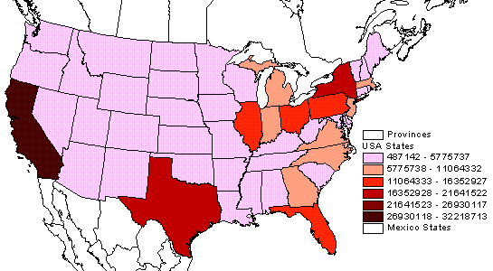
Classification of choropleth maps were orginally used to minimize colors used for representing data as well as reducing subjectivity of data representation when printing maps. Three methods of classification include: classification into equal intervals, equal frequencies of objects in the classes, and statistically optimal classification. This classed choropleth map gives six different colors which are intervals representing state population figures.
31. Range Graded Proportional Circle Map
A range graded proportional circle map uses a proortional circle map model but with circles that relate to ranges of data, where each varient of size represents a specific range of data on a scale. This map shows the population of countries in Europe using circle ranges.
Thursday, June 23, 2011
30. Continuously Variable Proportional Circle Map
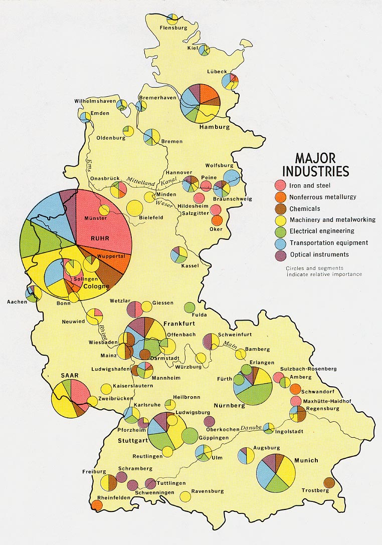
Continuously variable proportional circle maps are similar to regular proprotional circle maps except these add more than one variable. As with this one of Germany, this map s depicting the different major industries that were popular in various parts of Germany in 1972.
Monday, June 20, 2011
29. Digital Orthophoto Quarter Quads
DOQQ's are digital aerial images produced by the USGS which use orthorectified aerial photography at a resolution of 1 meter. This is a DOQQ of Kymartian, Kentucky. Because they have been adjusted for topographc use, they are accurate representations of the earth's surfaces and may be used to measure true distances.
28. Digital Elevation Model
DEM's are digtal or 3D representations of surface terrain on Earth or even other planets, usualy just regarding height information. This DEM shows Mount Shasta from the south, overlaid with USGS topographic mapping.
27. Digital Line Graph
A Digital Line Graph (DLG) is created from USGS maps with digital vector representations of cartographic information. This one is a hypsography DLG, which refers to the measurement and depiction of the terrain surface; these and hydrography surfaces are preferred sources where DEM's are produced.
26. Digital Raster Graphic
A digital raster graphic is a scanned image of a U.S. Geological Survey topographic map, then the image is georeferenced to the earth's surface and fit to the Universal Transverse Mercator projection. This is a 1:250,000 scale DRG of Hartford, Conecticut; it is highly detailed presenting many different types of information.
25. Isopleths
An isopleth map simplifies data with a continuous distribution, showing the data with a contour line connecting same ratios/amounts of some geographical or meteorological characteristic on a map; they are common for mapping elevation, precipitation, atmospheric pressure, etc. In this map, isopleths were drawn around municipalities of equal levels of development in the Bicol River Basin.
24. Isopachs
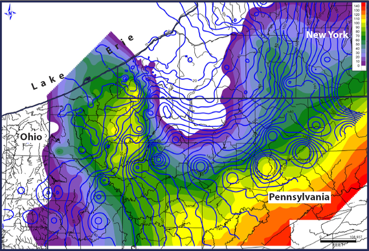
Isopachs are contour lines which represent equal thickness, displaying on a map sediment thickness stratigraphically rather than true vetical thickness. This isopach map depicts the thickness in feet of Tully Limestone with isopachs of the Moscow Shale, the thick blue lines.
23. Isohyets
Isohyets are lines that connect points which recieve equal amounts of rainfall. The isohyets in the map shown here show the equal amounts of annual rainfall found throughout Australia. It's much easier to tell where the desertlands may be found with a tool like isohyets.
22. Isotach
Isotachs are lines that connects points with equal winds speeds. The map here displays the U.S. and with the isotachs we are able to see the strong winds downstream along the east coast.
21. Isobar
An isobar is basically a line drawn on a map, usually a weather map, connecting points of equal pressure. This map shows isobars spread across Wyoming and South Dakota; you can see the very strong wind pressures with the help of the isobars.
Thursday, June 16, 2011
20. LIDAR
An optical remote sensing technology called LIDAR (Light Detection and Ranging) may measure properties of a target, such as distance, by illuminating the target with light; oftentimes using a laser. This LIDAR image was from Sept. 15, 2001; they were able to use LIDAR with elevation data to look through smoke and assess the damage of Ground Zero.
19. Doppler Radar
Dopler radar uses the returned echo off of certain objects to measure radial velocity, portraying different colors which represent the varying intensities. This particular Doppler Radar image is of Hurricane Katrina nearing New Orleans in 2005. The legend on the side tells you exactly what colors mean and you are able to tell the intensity.
18. Black and White Aerial Photo
A black and white aerial photo shows the visual of an area using shades of black and white, showing only what's basically visible without going further into detail. This one is of a highway system in Baltimore, and although you are able to understand the gist of what is in the picture, it's more difficult to tell different aspects apart, such as what is vegetation, etc.
17. Infared Aerial Photo
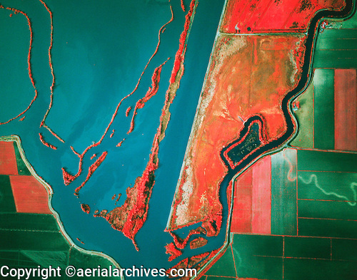
An infared aerial photo can be used to document changes in the environment or other aspects of the land, and the colors relfected have different meanings, such as red for live vegetation, beige/green for dead vegetation, white for sand, blue/green for different soil types, etc. This infared aerial photo was take of a Sacramento ship channel, and can be used for agricultural/environmental purposes.
16. Cartographic Animation
Cartographic animations attempt to depict change, usually over time but they may be non-temporal as well. The one shown here is a still from a map animating how the solar industry will create jobs over time in different parts of the United States.
15. Statistical Map
A statistical map often displays a change or variation in the region, displaying statistical data which relates to a certain area. This is a spike map which presents data about where the majority of people live in the U.S., revealing about how many people live in metropolitan areas per square mile (this one goes up to 100,000 people per sq.mi.).
14. Cartogram
A cartogram is a diagram or abstract map where area is distorted proportionally to the value of a characteristic. So, in this cartogram, the United States looks distorted because it is showing the 2004 election and the percentage of Democratic and Republican voters by county, blue and red, along with shades of purple which shows the stronger/weaker leaning towards one party or the other.
Friday, June 10, 2011
13. Flow Map
A flow map uses line symbols of various thickness to show the proportion of traffic or flow within a network, showing the direction of the flow, not necessarily the actual path. Oftentimes, these show economic or social patterns, such as the one shown here which depicts European countries with traffic flows between them.
12. Isoline Map
Isoline maps use continuous contour lines to join points of equal value. This is an isolene map of the Antarctic, having used various images and data to find geoid height. Temperature, altitude, pressure, and wind are all aspects that are often taken into account to create these maps.
11. Proportional Circle Map
A proportional circle map uses a symbol (often a circle) to represent a phenomenon, differeing in size to relate to the value of what's being mapped. This proportional circle map depicts traffic fatalities by U.S. state, ranging from 10, 100, 500 and 1000.
Monday, June 6, 2011
10. Choropleth Map
A choropleth map is basically a thematic map where different areas are specifically colored or shaded to represent various values of a particular phenomenon based on aerial units. This map was made to show the percentage of people who are Hispanic per county in Florida, based off of the 2000 census.
9. Dot Distribution Map
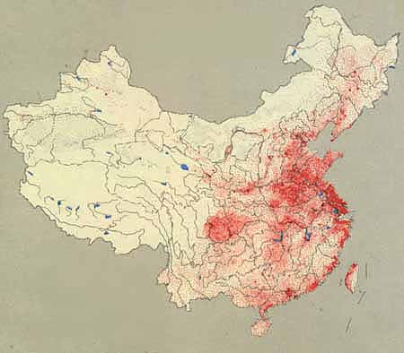
A dot distribution map uses dots (or sometimes other symbols) to represent the presence, quantity, or value of something in a specific area. Many times the size of the dots are scaled in proportion to the quantity of whats being represented. This is a dot map of China's population density, where each red dot represents 50,000 people. Obviously, the areas with many dot clusters are much more populated than those without.
8. Propoganda Map
Propoganda maps are created by twisting reality to convey a message to a population. It is often a political or wartime tool to instill feelings such as fear or pride into a people or nation. This one was created by the Japanese during the Russo-Japanese War, calling Russia the Black Octopus, writing in both English and Chinese, obviously attempting to rile and get a message out.
Saturday, June 4, 2011
7. Hypsometric Map
Hypsometric maps show relief with color, shading, contours. Typically, each shade will represent a different elevation. The Hypsometric map shown here presents the terrain of North America and it's elevation relative to sea level.
6. PLSS Map
Public Land Survey System maps are used to divide lands owned by the U.S. Federal government; the public domains are regulated by the Bureau of Land Management, typically dividing land into six mile townships, subdivided into thirty-six one square mile sections. This PLSS map is of a portion of Utah and the square miles are clearly marked.
5. Cadastral Map
Cadastral maps show how land has been divided, presenting ownership of parcels with boundaries. The map shown here shows different property lines for land area in Canada. As you can see, they put information like which district, city or number plot is represented, but they often leave out particulars. It's common to divide the coast into narrow rectangular strips coming from the coastline for agricultural purposes.
Thursday, June 2, 2011
4. Thematic Map

Thematic maps are designed to convey information about a single topic or theme, such as population density or geology. The thematic map shown above depicts the Hispanic population density in the United States. However, they can be used to depict anything from population density to soil types, age, spatia patterns, etc.
3. Topographic Map
A topographic map presents both vertical and horizontal position of features, often showing contour lines, relief shading, and other measurable forms of relief. This topographic map shows the different depths and curvatures in and surrounding Crate Lake, Oregon. All of the different "squiggles" and lines represent heights, distances, etc.
Wednesday, June 1, 2011
2. Planimetric Map
Planimetric maps show the horizontal positions of features in an area, not both horizontal and vertical. This map presents the railroads, trails, power lines, roads, etc. of the Debert Industrial Park. This does not provide relief features and is also known as a line map.
1. Mental Map
This is a mental map that someone drew of their area. They took what they knew of the area, or how it appears to them, and mapped it out according to their personal perception. Mental maps aren't necessarily always completely accurate, but they indicate how people view their world.
Subscribe to:
Posts (Atom)
