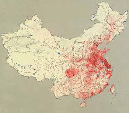
A dot distribution map uses dots (or sometimes other symbols) to represent the presence, quantity, or value of something in a specific area. Many times the size of the dots are scaled in proportion to the quantity of whats being represented. This is a dot map of China's population density, where each red dot represents 50,000 people. Obviously, the areas with many dot clusters are much more populated than those without.

No comments:
Post a Comment